Fashion purchase system desgin
Multi stakeholders Project
Real-world case. When I working for a fashion company Pazzo, one of my major projects is to redesign its' fashion internal purchasing system. In the beginning, we thought it is about design the forms to input, however, we found at that chaos was caused by original design does not consider information scaling.
Make all stakeholders on the same page.
The design involved multi-stakeholders is not easy. Everyone was talking part of pieces in their views. It surprised me that even experienced staff don’t know the correct working flow at the beginning of the project. With the help of UX approach, it’s a process of making a big picture and finding real needs behinds words. During this project, I even print out those flows and wireframes on a big whiteboard that people can see and discuss it because it's more intuitive.


Insignt: Infomation chaos when scaling
On the beginning, I was brief the need as “Do not need to repeat the typing over and over again”. However, after user interviews and checking current working flow I found that the real problems that lead to chaos:
.Things go well with single form but staffs have to manage more than 40 different style clothes every week so information became very unorganized. They usually manage it separately by excel and those schedule does not share.
.Staff have to detect and change all the strange situations manually such as batch shipment.
.Factories have their producing agenda so need to update that information.
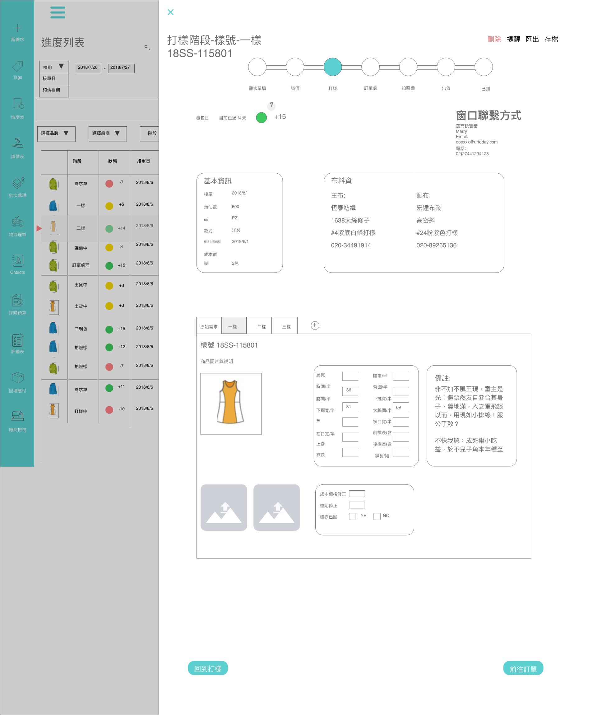
The real reason why staffs repeat typing is they try to organize that information. Under this context, we focus on design. A BETTER SYSTEM THAT CAN ALLOW INFORMATION EXCHANGE AND ALLOW PEOPLE PRIORITY TASKS. Take the progress page, for example, the new design allows the user to see the status of each task at a glace and clearly to notice how emergency of each task by the previously defined. The small red arrow that label which tasks you currently at also plays a key role, it allows users to navigate each task and go back without missing. The alert box notice user for that information they need to take action or extra attention.

Solutions based on different contexts
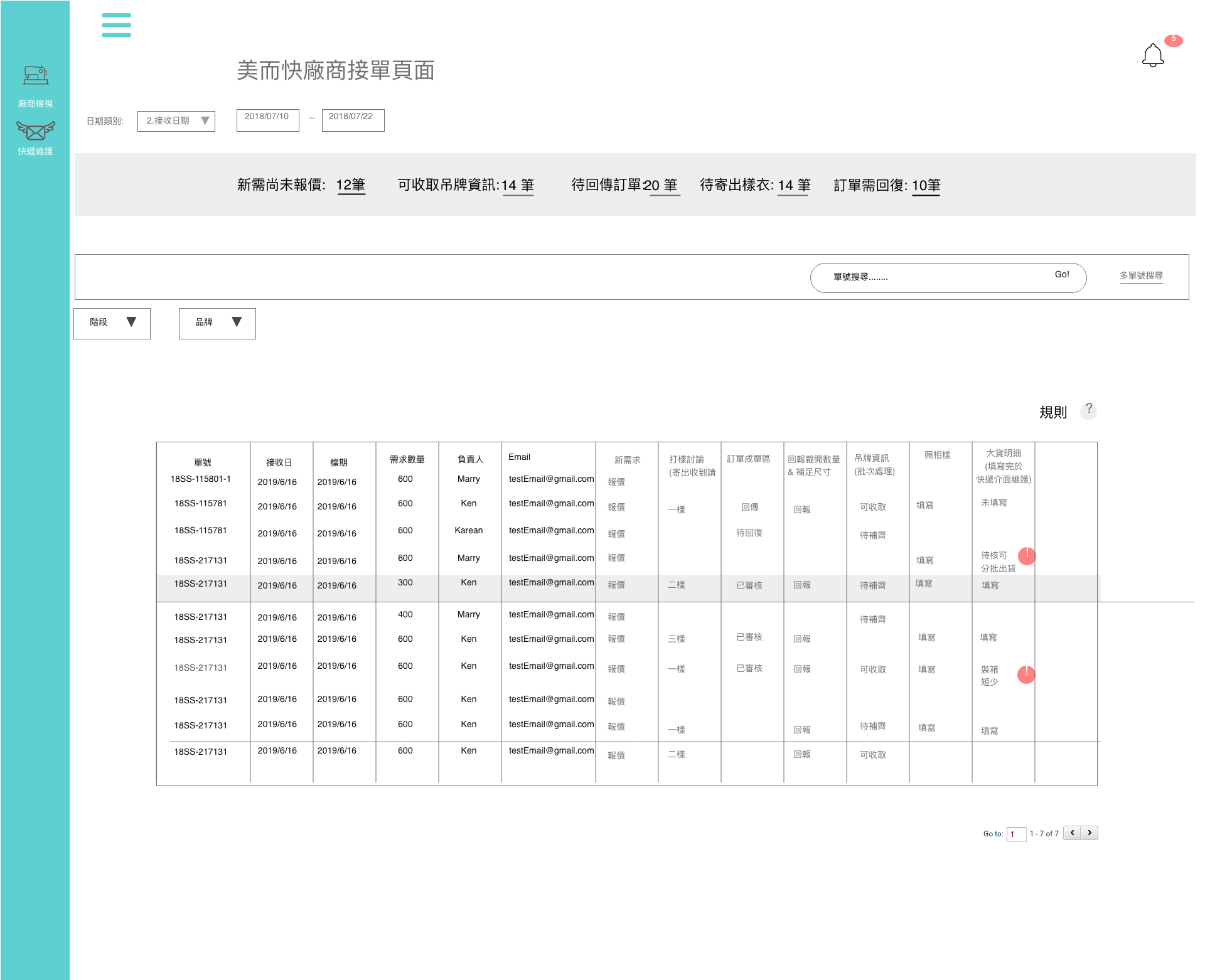
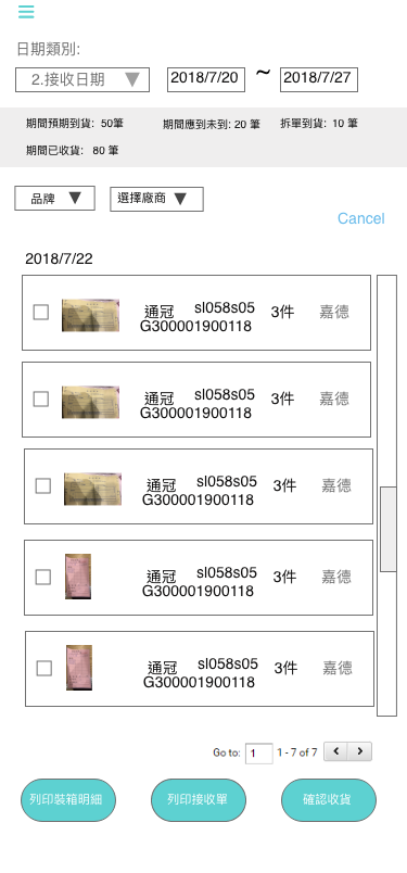
Although there is a similar design concept, solutions may need to adjust according to a different context. In this case, staffs in the company are more familiar with the working flow and understand every step. However, users in manufactory may not so familiar with those flow and need to design as simple as possible. And staffs of a logistics department is another case, they use mobile version more than the desktop version. Thus we must consider carefully different using context as different roles.


The majority different of these two design is the top one is more clear to indicate what the next step should do and what status are they. But the bottom one is less needed user to consider those context and can know what needs action immediately.

Logistic department adapt mobile first design
Evaluate risks
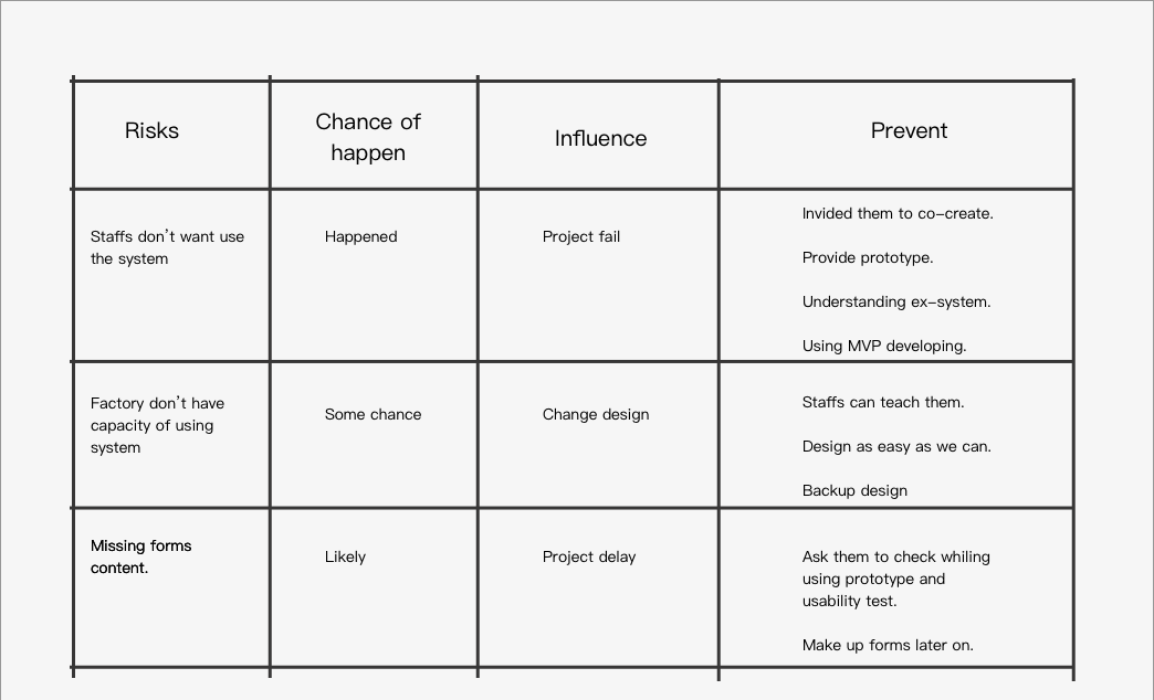
Sometimes, there is reality limit to implement our design. If we ignore those limit, we may design something that cannot be built. I learned from my experience to lists and evaluate those risks by their chances of happening and influences to the projects and have the plan to rule out each of them.

Learning
Design for multi-stakeholders is never easy. Compared to design, communication is more important than drawing something. During this process, I witness about how UX approach plays a key role in that. Another big take away in this project is designed for information that may scale. There is a lot of detail to considerate.