Freezer
UXUI Project
"The refrigerator to help you and family live better"
Refrigerator used to be a place to cool food and make is stay longer. But in the future the refrigerator is generated see as can be touched, linked to internet, and can be monitor food inside to help people better prepare meal. View full case study here
Functions
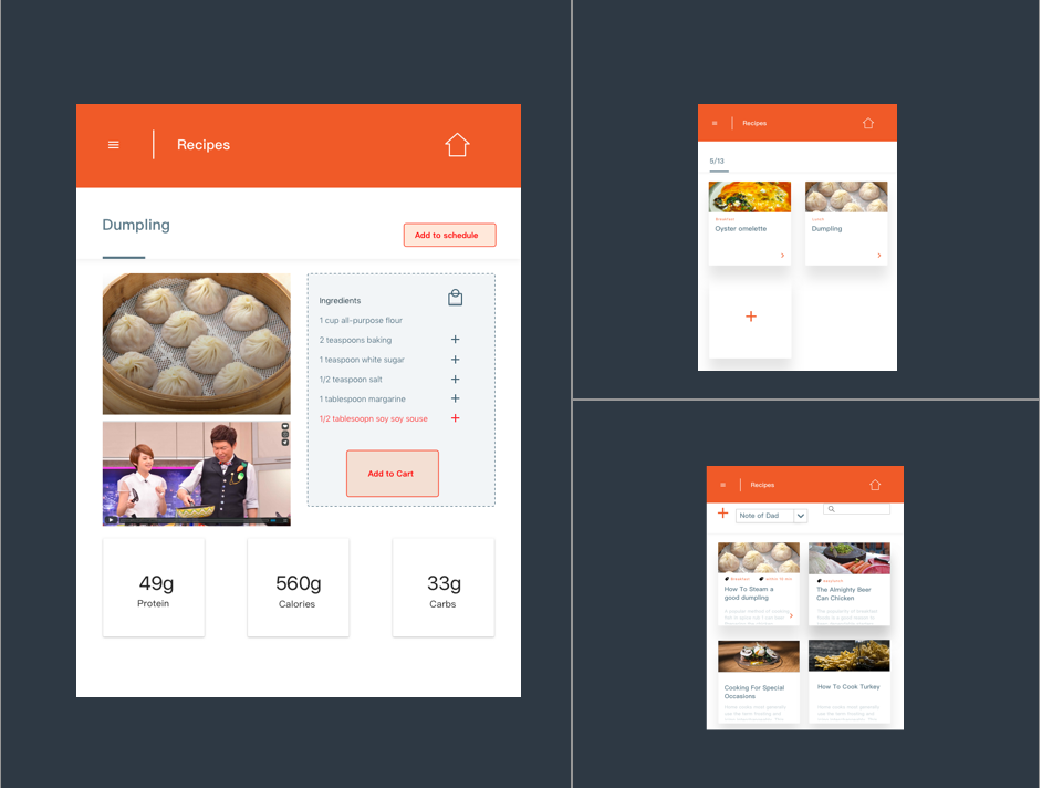
1. Food Recommendation
2. Meal Planner.
3. Shopping online.
4. Web note
5. Expire
6. White board
I cooerated this project with my classmate Rye
My role include:
Problem
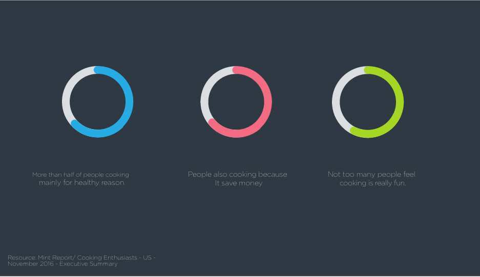
According to the report, the study indicates that contrast to our stenotype, most of people cooking for healthy reason or saving money than just enjoy. At the same time, people are busier than ever, it’s hard to invest so much time in cooking. Therefore, how help them cook more nutrition and efficiency in cooking is a important challenge.
solution
With the help of technology, we can recommend people what to eat based on the nutrition fact and what do they have in the refrigerator and shop food or ingredient at home. Besides, we also propose to provide a better way for users to organize their meal plan.
01.Theory
02.Key Features
Design Process
03.Aapproach
This two-month project covered analysis, design, evaluation and refinement.
3.1 Analysis:
To take off with this project, we studied several cooking research to understanding the possible needs based on the society change. we also research current competitors and upcoming technology to realize the technical limit. After that, we summarized primary and secondary persona and their use context.
3.2 Design:
After confirm the main function based on users scenarios, we developed information architecture for the refrigerator and Lo-Fi UI sketch.
3.3 Evaluation:
We selected few users and went to their home to post the paper sketch on their refrigerator for testing. Based on the results, we have our first version Hi-Fi mockup. And we repeat the process for keeping polish.
3.4 Refinement:
We literate the design according to two main leanings. Detail explain below.
04.Target Market
| AGE | THCH LEVEL | KEY FEATURES |
|---|---|---|
| 30 - 45 | Medium | People who cook often. |
05.Persona
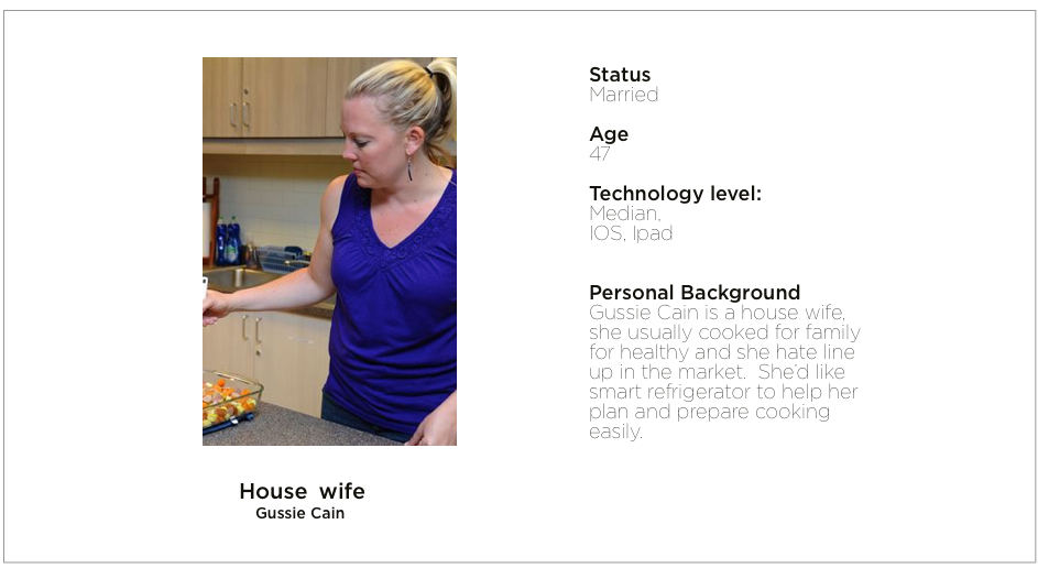
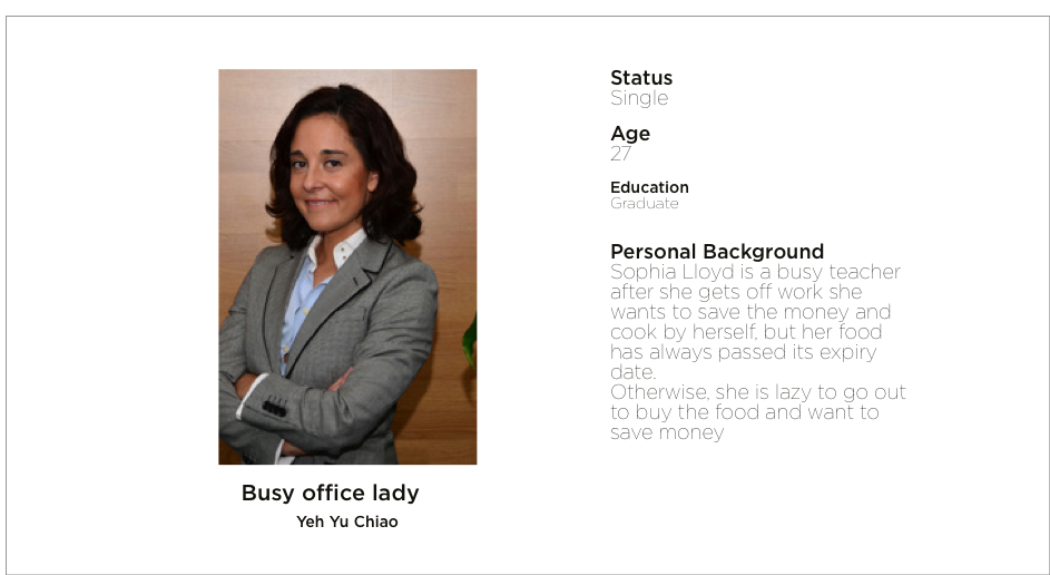
5.1 First persona
“I want to cook healthy food for my family.”
5.2 Secondary persona
“Planning ahead and eat efficiently.”
06.UX Solutions
6.1 Giving recommendation instead of data
Start with the project, I designed the interface based on some workout app. It showed a great deal of information and user can do they calculate to setting their goals. Planning their meals based on calories. However, when we put up the wireframe paper in the tester’s refrigerator. We found a lot of users showing confuse during the decision process. Consider a lot of our users may not as familiar with technology as us, we decided to use recommendation instead of providing data.

6.2 Not using dark color in somewhere not light enough
Another decision we made after testing is changing dark color into the brighter color. We got brunch of negative feedback on colors in the old version. Although the dark one looked elegant but did not cause people feel delicious. Besides, the users also reflected that their kitchen didn’t have enough illumination. That caused the readability problem on the interface. It’s a good lesson about considering the setting and the environment lighting in design.


